


Phone (703) 297-6471
info@brandonwharton.com
Brandon is a full-stack UX design generalist with over a decade of design experience. He possesses a unique skill set that combines creative talent, expert technical skills, and first-rate interpersonal skills, enabling him to become an interaction, visual, motion, and product design expert. Skilled at conducting UX research, using design thinking processes, and leading a team, taking on both large and small projects.
Summary of Qualifications:
- Proficient at eliciting business requirements and user research to design high-fidelity products
- Experienced in prototyping, creating design systems, responsive web design, coding, and mobile-first design methods
- Designed for major organizations including Walmart, Sam’s Club, DOS, HHS, United Bank, Cardinal Bank, Lowe’s and Kohl’s
- Well-versed in multiple technologies including Figma, Sketch, Adobe design software, HTML, CSS, SCSS, JavaScript
- Designed for major organizations including HHS.gov, Walmart, Sam’s Club, United Bank, Cardinal Bank, and Kohl’s
- Experienced managing a team of Web Producers for a non-profit organization
Experience:
Walmart - Remote
May 2022 – Aug 2024: Senior UX Designer
Designed end-to-end omnichannel commerce products and experiences around order fulfillment, serving more than 230 million customers per week, which brings in over $160 billion in total revenue per quarter for the largest company in the world. Designed user flows including substitutions CX (potential $12+ million GMV increase), adding last-minute items to express deliveries (potential $260 million GMV increase), our search page’s product fulfillment labeling ($224 million GMV increase), a feature to save customer’s preferred store and address, and more. Some responsibilities included:
- Design, innovate, and develop ways customers complete and receive purchases through pickup and delivery.
- Set the vision for the best customer experience (CX) and created a collaboration space for cross-functional colleagues.
- Make research-based, customer-first design decisions, delivering high-fidelity prototypes for dev and presentations for share-outs with the broader team.
Crimson Phoenix/GDIT/DOS, Chantilly, VA - Remote
December 2014 – May 2022 (full-time) – Present (part-time): Senior UX Designer/Developer
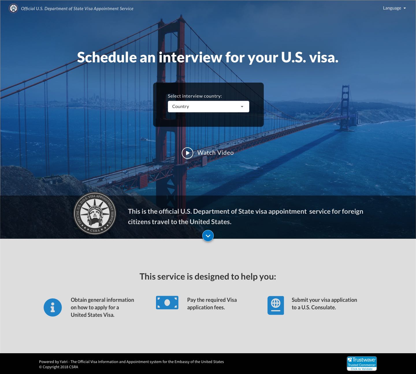
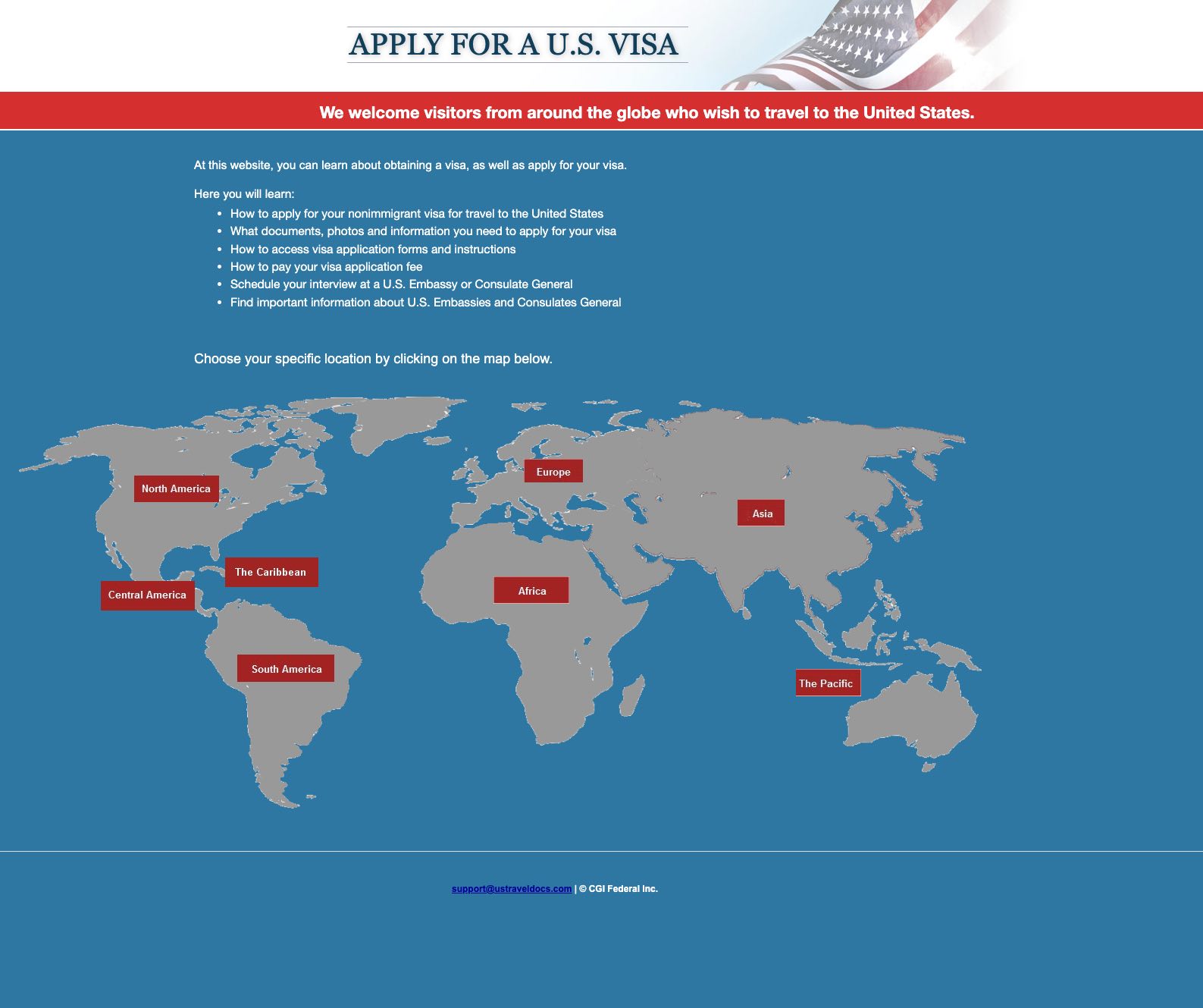
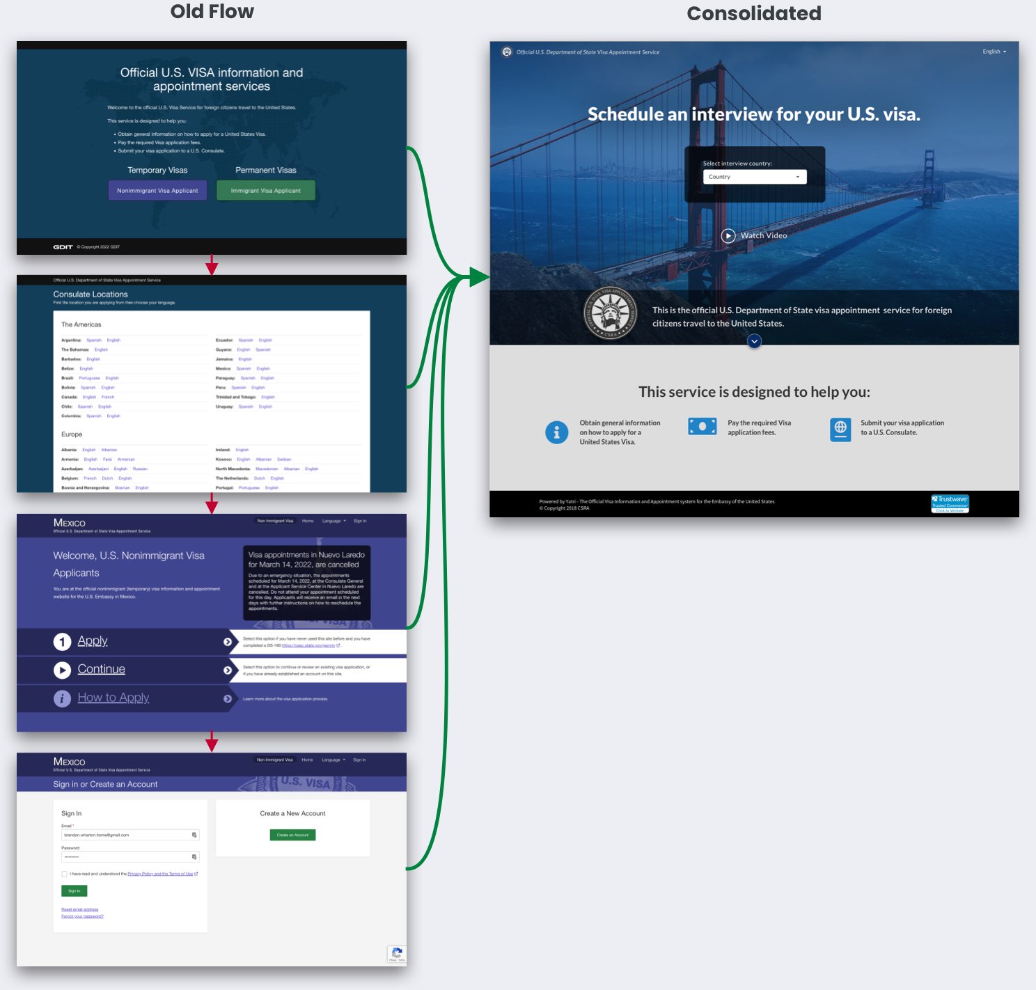
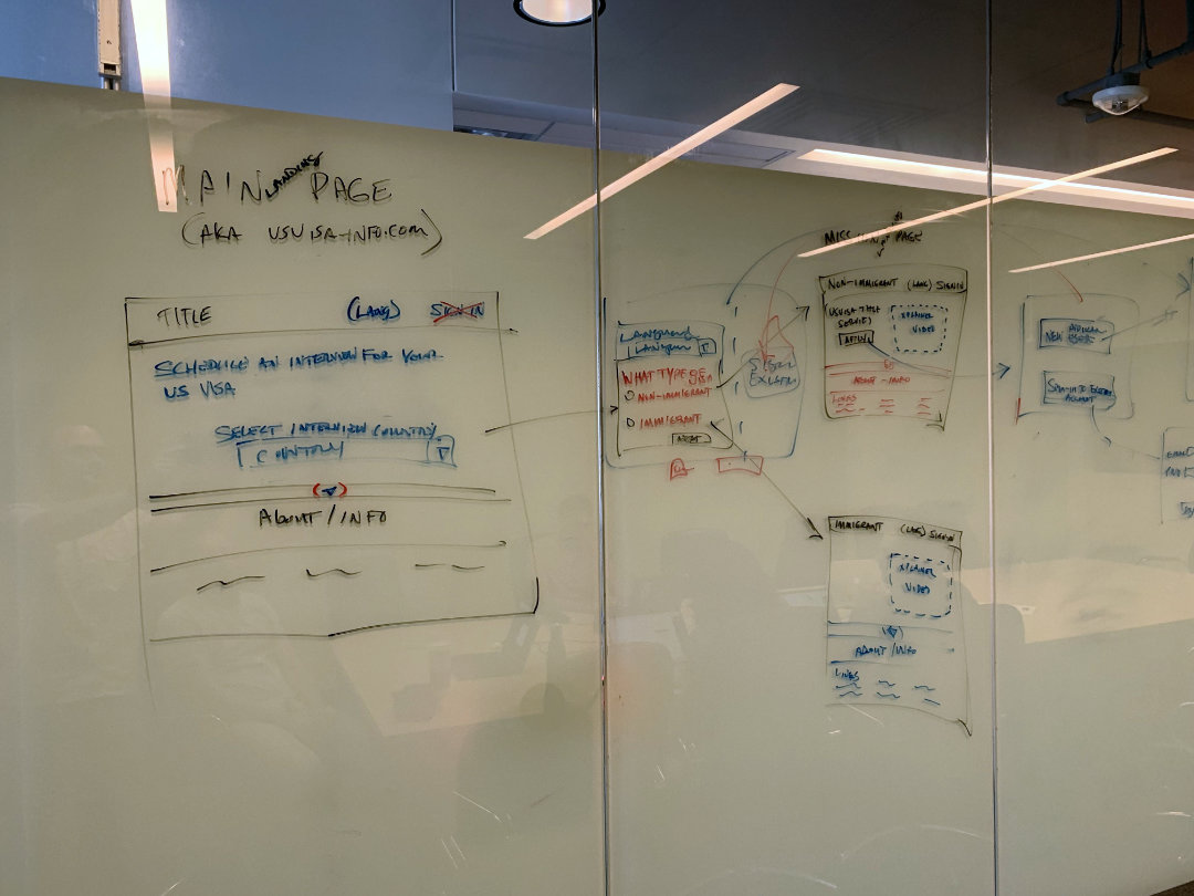
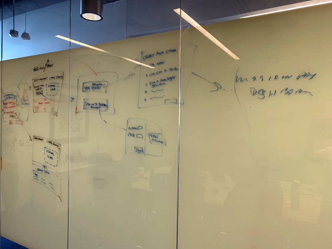
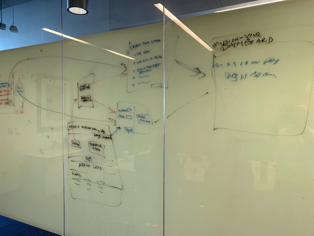
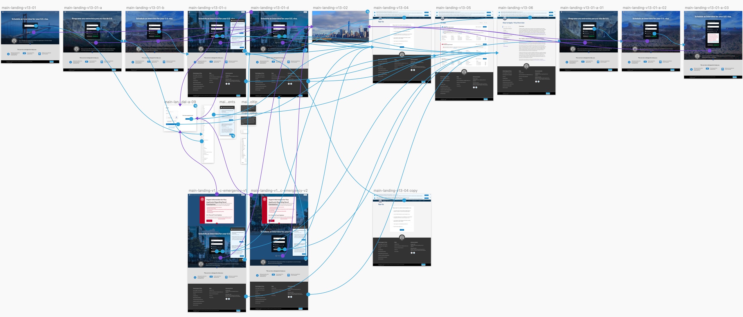
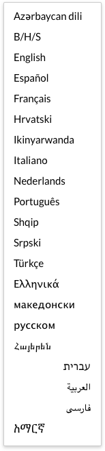
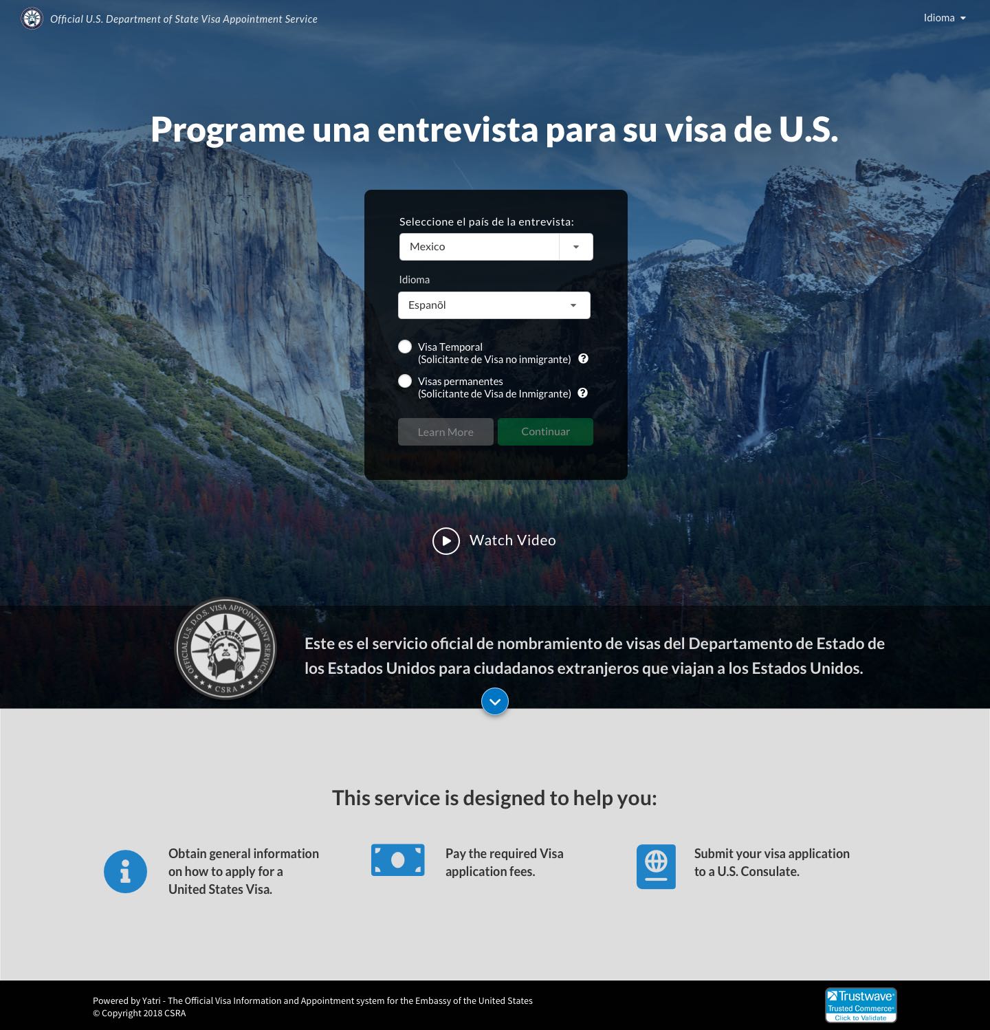
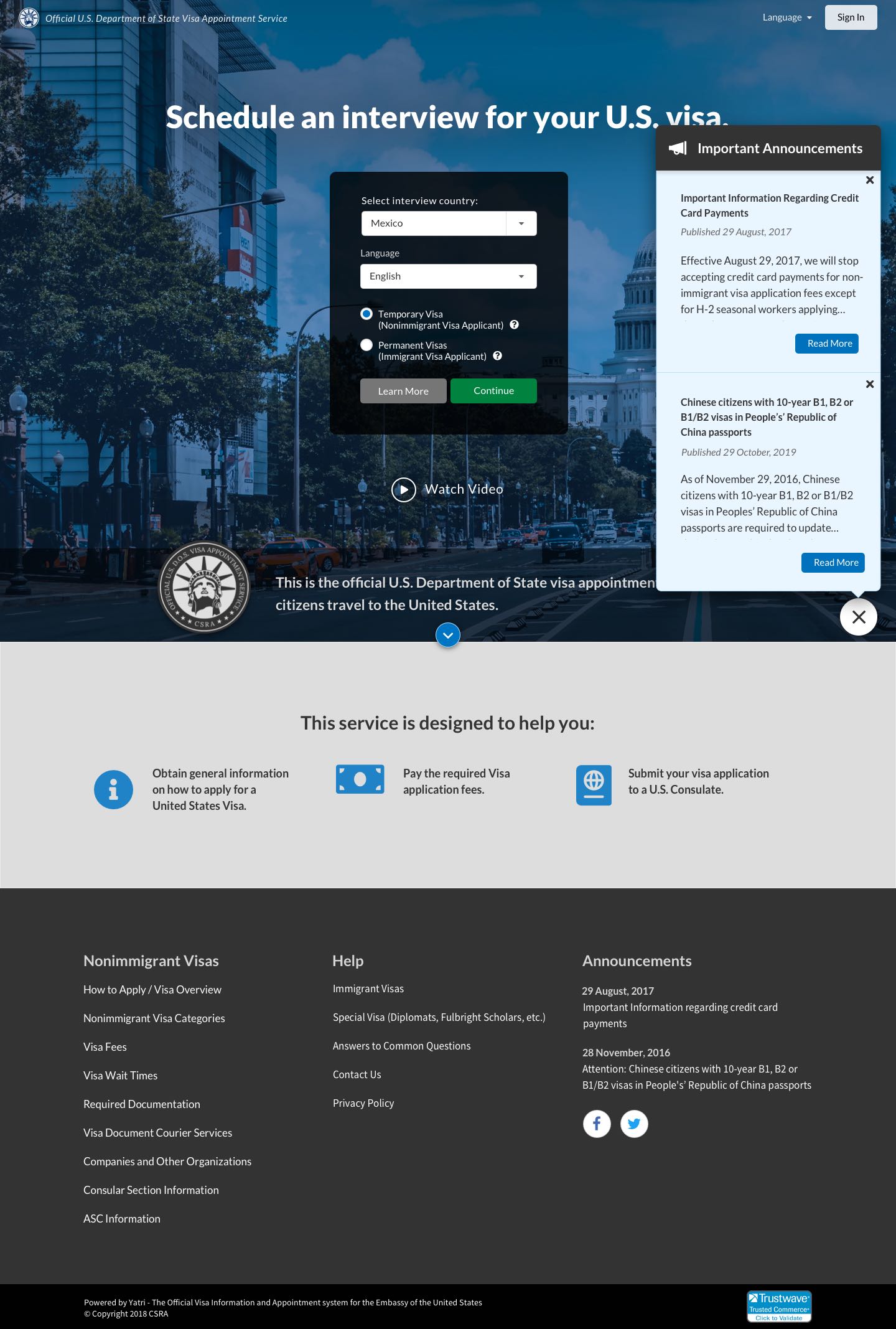
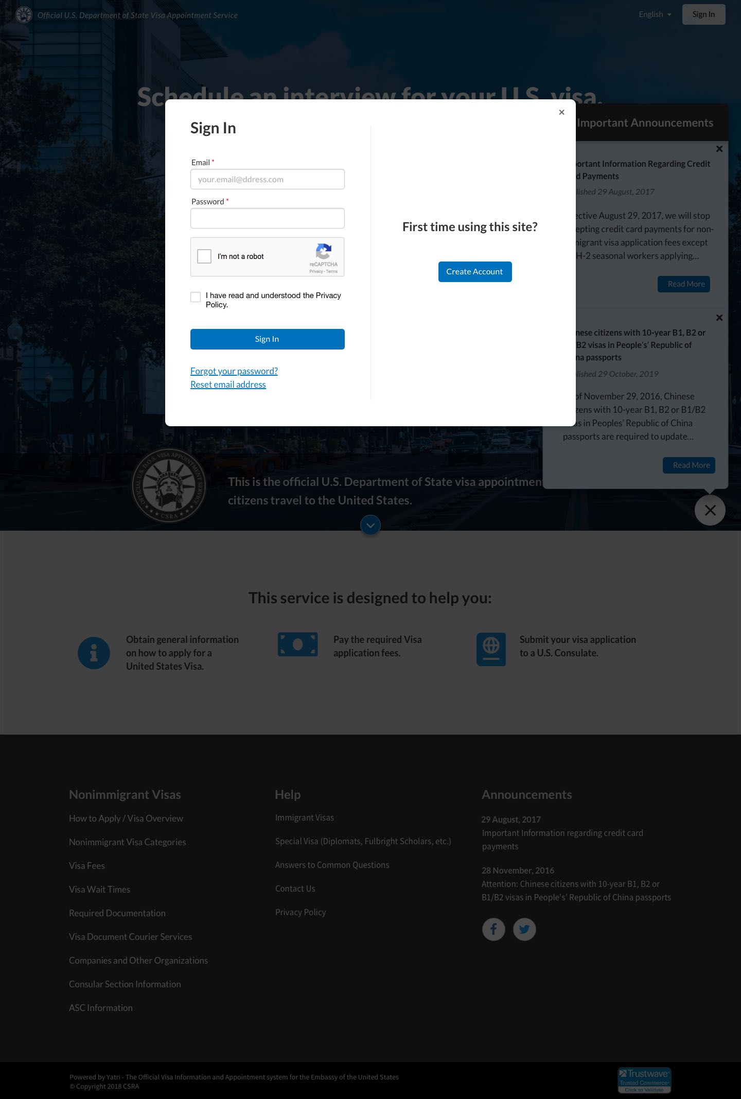
Design and code UX’s for multiple high-traffic web applications supporting the Department of State's Global Support Strategy (GSS), serving over 500K weekly users across half of US visa-issuing countries worldwide. Ensured accessibility through 21 language translations, including complex right-to-left layout languages (Hebrew, Arabic, Farsi), and optimized user experience with responsive design. Some other accomplishments and responsibilities include:
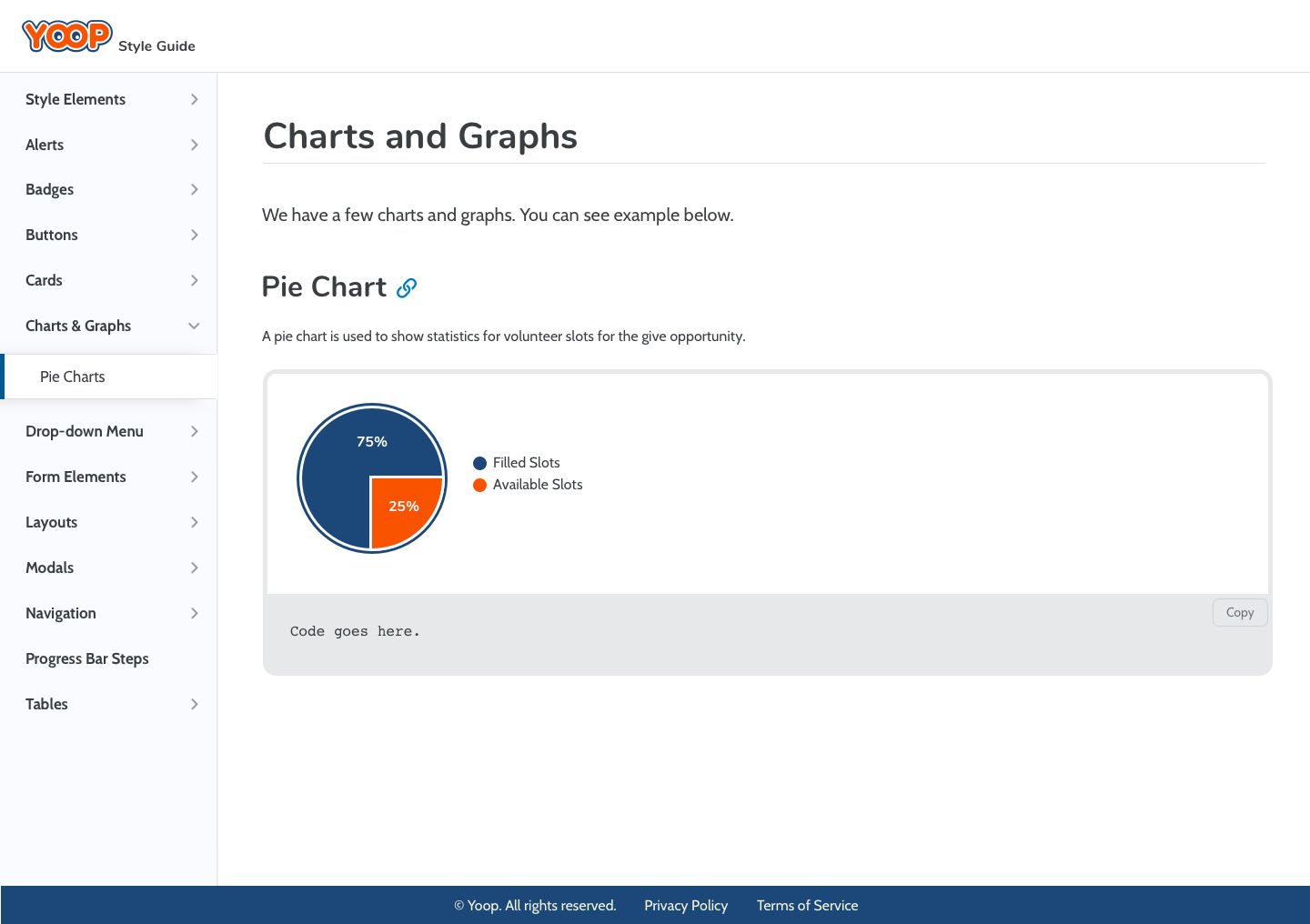
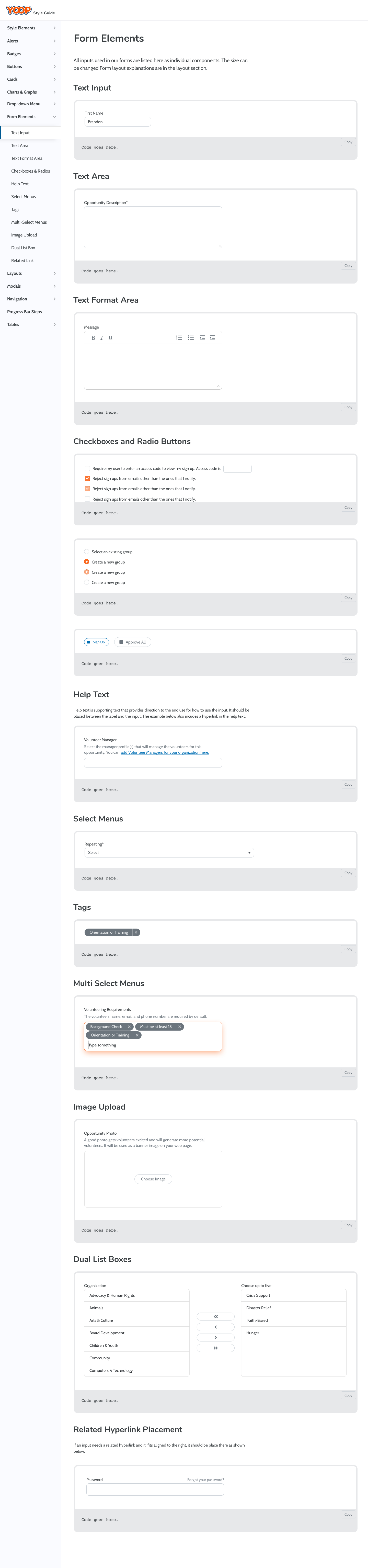
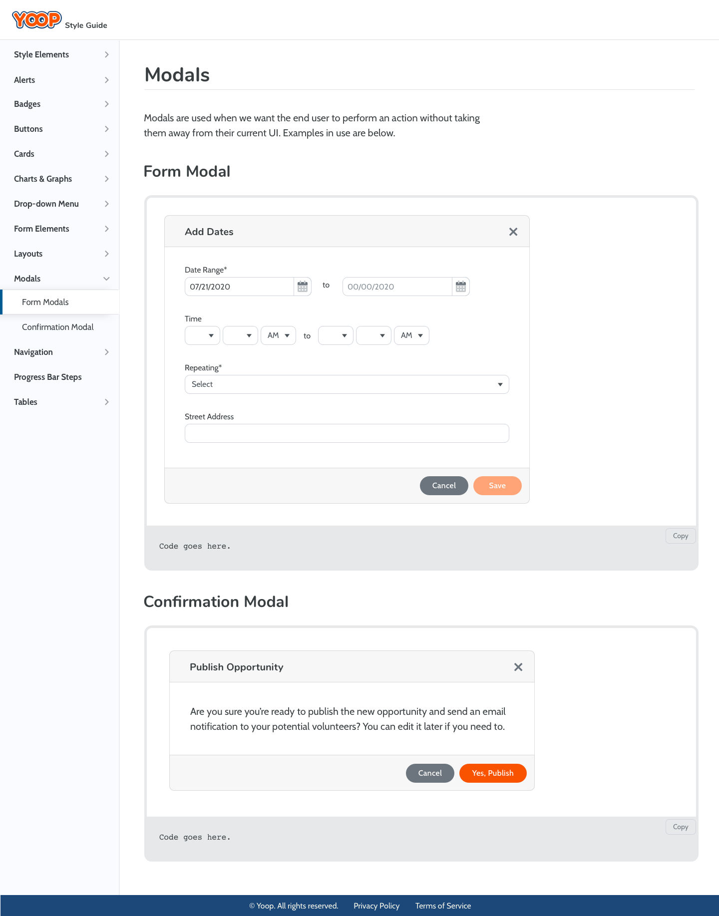
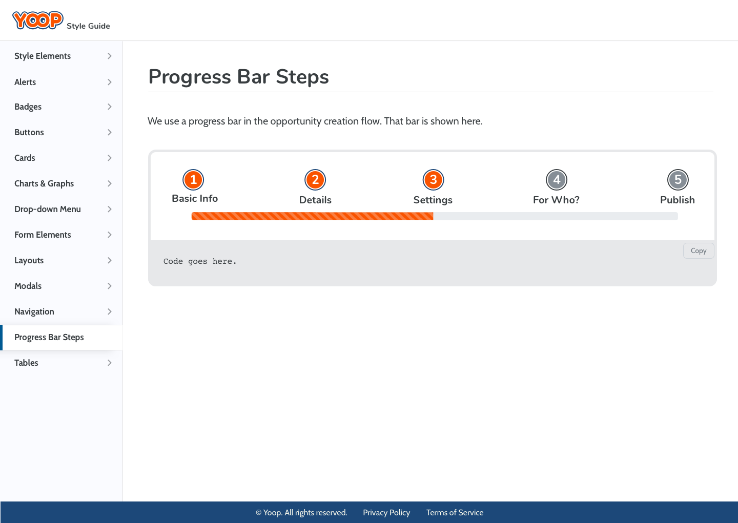
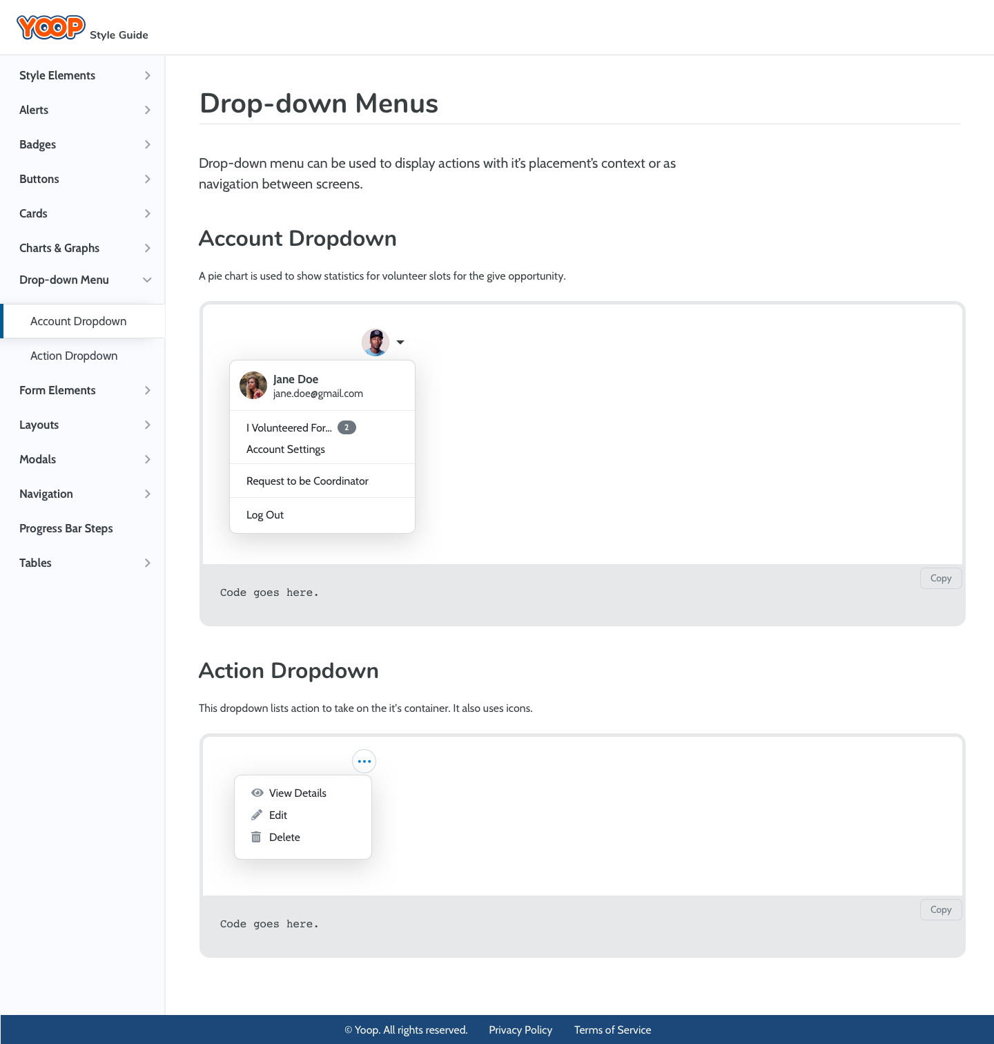
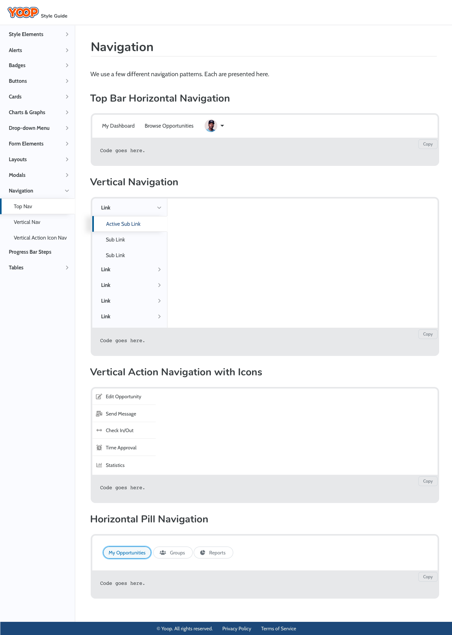
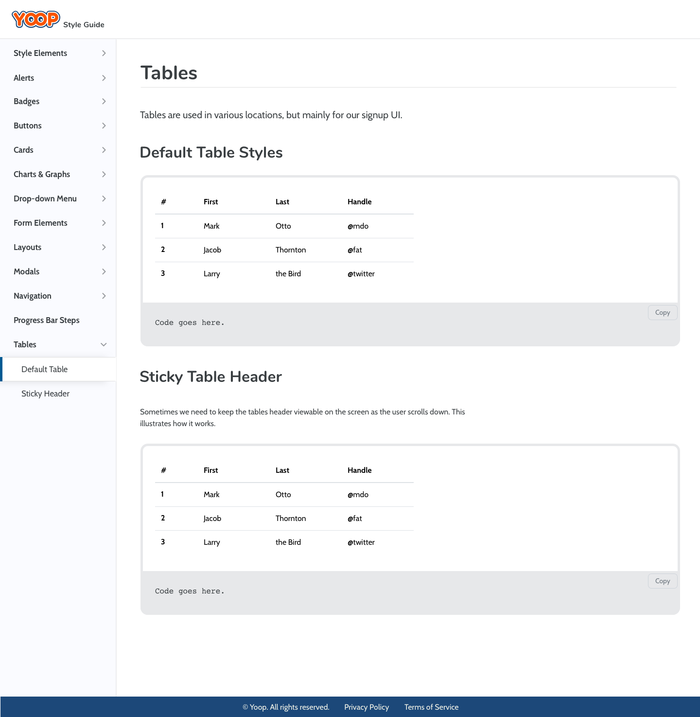
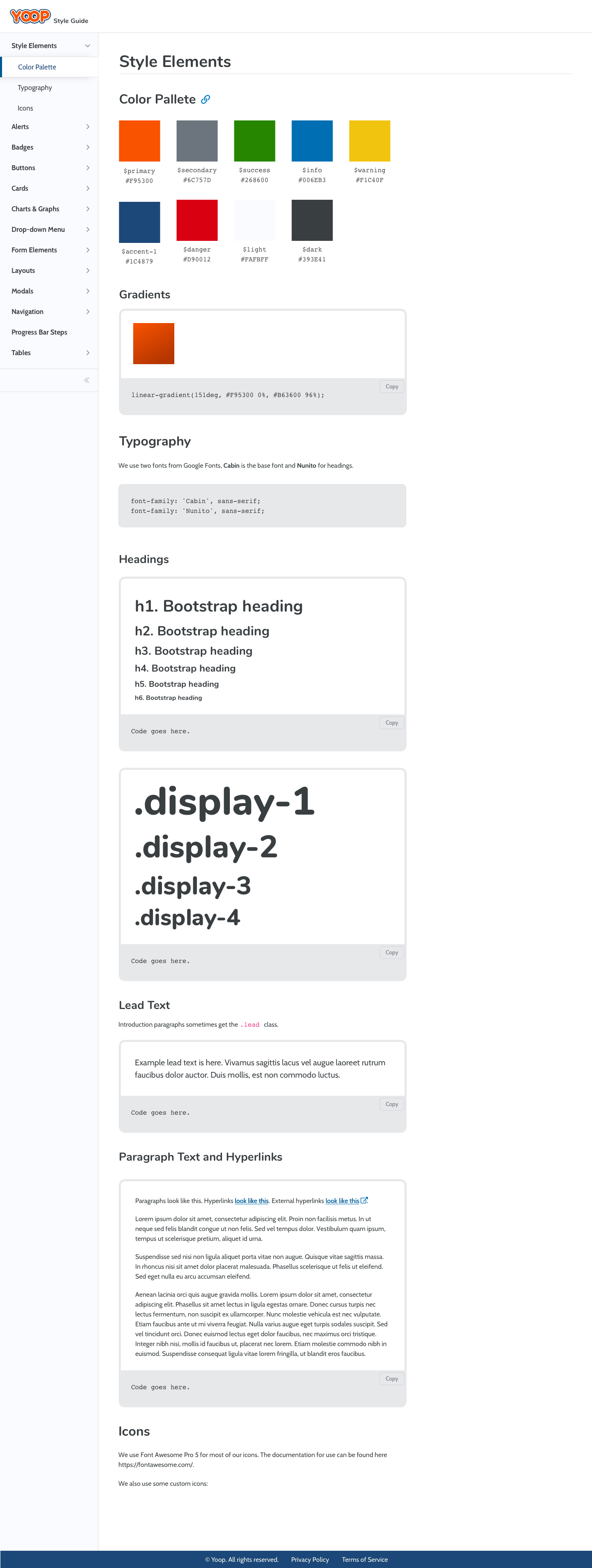
- Create a design system consisting of a style-guide webpage with components, code, and usage explanations. This resulted in consistent style implementation of new features regardless of the assigned engineer. Also, create a Sketch library for fast and easy UI component reuse in prototype creation, increasing speed 10-fold.
- Create clickable prototypes using Sketch and InVision software for team collaboration and requirement refinement.
National Quality Forum, Washington, DC
January 2013 - September 2014: Senior Web Producer
April 2011 - January 2013: Web Producer
- Designed UI for our Quality Positioning System (measure search) web application, the home page, project pages, and other templates built in the Ektron CMS.
- Designed and coded email templates using Informz and oversaw our mass HTML email operations. Managed web content to ensure style consistency and correctness. A key part was creating a web standards wiki for documenting and sharing internal processes, resulting in reduced decision-making, saving time, and effort.
- Collaborated with public relations managers to identify current, new, and future content. Develop a plan for implementing and setting schedules for new content integration.
- Managed web team staff of three, overseeing workloads, monitoring operational needs, making recommendations, overseeing the implementation and use of tools and infrastructure to ensure productivity, leading weekly team meetings, performing annual reviews, providing a weekly report to senior staff, and reviewing timesheet billing for accuracy.
- Managed web request ticketing system and contributed to initial ticket system design, resulting in a streamlined workflow that reduced time and effort. Worked to improve this process on an ongoing basis.
Glynn Technologies, Bethesda, MD, and Washington, DC
April 2009 - February 2011: Web Designer
- Designed UI's for HHS.gov, HealthCare.gov, Flu.gov, FoodSafety.gov, United Bank, Cardinal Bank, ArlingtonVirginia.com, and others. Coded using current web technologies ensuring valid, properly structured code meets industry standards.
- Managed Drupal content management system (CMS) for ArlingtonVirginia.com, installing, and configuring various Drupal modules. Wrote a CMS style guide to establish design and production workflow standards/processes.
- Worked on location with clients in fast-paced environments including the U.S. Department of Health and Human Services.
Independent Consulting, South Riding, VA
December 2008 - April 2009: Product Designer
- Designed and developed a new marketing campaign for Wellmade Performance Flooring. This included a WellmadeFloors.com website, merchandising display systems, point-of-purchase materials, packaging, stationery, brochures, and flyers. Coordinated production efforts with copywriter, printer, and client.
Black Rock Communications/BR-111™ Exotic Hardwood Flooring, Germantown, MD
May 2005 - December 2008: Graphic Designer
- Designed BR-111™ websites, magazine advertisements, brochures, catalogs, flyers, installation manuals, sales manuals, product packaging, and trade show signage. The magazine publications include House & Garden, Interior Design, Metropolis, Midwest Living, Floor Covering Weekly, National Floor Trends, and others.
- Managed, designed, and produced multiple point-of-purchase merchandising projects for Lowe’s, a $30 million national flooring account. This includes managing all language content and working with a third-party translation vendor, translating language from English to Spanish to gain final language implementation approval.
- Conceptualized, designed, and produced a new marketing campaign for the BR-111™ Architectural Series product line, including a merchandising unit, sales tools, catalog, and sample display.
Tropical Sportswear International, Tampa, FL
May 2004 - March 2005: Graphic Designer
March 2001 - May 2004: Junior Graphic Designer
- Designed consumer packaging, interactive presentations, promotional items, trade-show displays, marketing books, logos, letterheads, and collateral serving clients including Walmart, Sam’s Club, Kohl’s, J.C. Penney, Dillard’s, and Belk’s.
- Assisted in implementing signage, label graphics at trade shows (MAGIC and PGA Merchandise), directing photoshoots, and performing photo manipulation/color correction.
- Performed pre-press file development for mass production while developing comprehension in print processes.
Certification and Achievements:
- Google UX Design Professional Certification, September 2024
- Excelling as a Manager or Supervisor training course, April 2014
- CompTIA Security+, March 25th, 2011
- Outstanding Achievement Award in Typography, January 2002
- Outstanding Achievement Award in Page Layout, June 2002
Education:
Liberty University, Lynchburg, VA
Bachelor of Science in Management Information Systems with a minor in Church Ministries, March 2011
International Academy of Design and Technology, Tampa, FL
Associate of Science in Graphic Design, December 2003, Graduated Cum Laude
Skills (* indicates working knowledge, **intermediate, ***expert):
Figma***, Sketch***, Prototyping***, Wireframing***, UX Research*, Usability Testing**, 508 Compliance**, SEO**, HTML***, SCSS***, JavaScript*, GIT**, Responsive HTML Email**, Bootstraps***, Foundation***, Material Design***, Adobe Suite***, jQuery*, PHP*, ASP*, MySQL*, Ruby on Rails*, Drupal*, Ektron*
Security Clearance
September 2010
The Department of HHS provided a National Agency Check and Inquiries (NACI) investigation completed by the Office of Personnel Management and USIS for my non-sensitive position (level 1) at the Hubert H. Humphrey Building.